
Searching and charting
Databases - Lesson 3
Objectives
- To use different search function to find answers from a database
- To make a chart from information in a database.
- To be able to read and compare information on a chart.
Lesson Resources
Lesson 1 - Understanding databases
Lesson 2 - Searching and sorting
Lesson 3 - Searching and charting
Lesson 4 - A class database
Lessons 5 & 6 - A team database
Introduction
Recap the last lesson. Ask the class to talk to a partner and explain what these three methods mean for searching a database:
- Sort
- Group
- Filter
Sort it - Put it into an order. E.g. biggest to smallest, or A to Z.
Group it - Put matching things together. E.g. All mammals, all children aged 7.
Filter it - Hide information we don’t need. E.g. Only show children with brown eyes, Show animals beginning with ‘A’.
Searching and sorting databases
To reinforce these skills, ask the class to Open 2Investigate again and select Examples > Database with data > Card Mode > Countries.
This database can be viewed in card and table modes. They should use the Countries database to answer the questions on the Countries Data Detectives sheet(opens in new tab). They will need to sort, group and filter the data to find the answers.
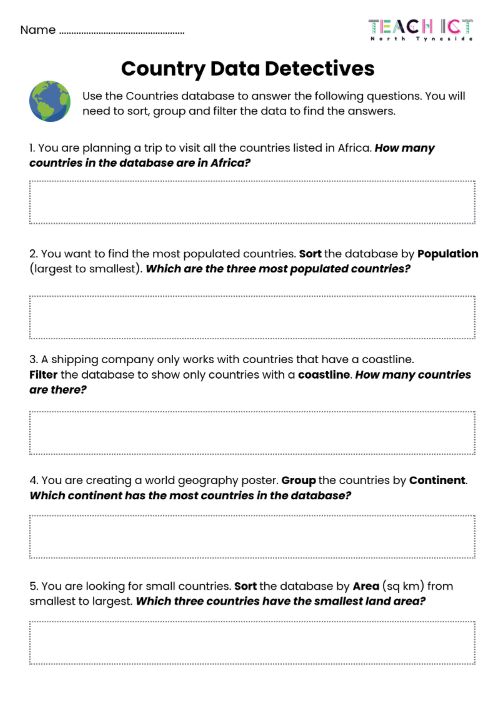
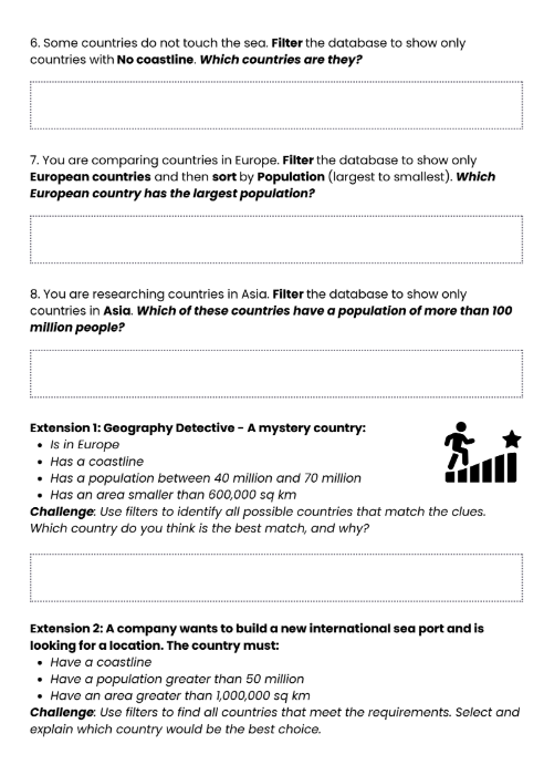
Answers are provided on the lesson slides for you to review with the class at the end.
Turning data into charts
Ask the class - What types of graphs or charts do you know about already? Where have you used or seen them?
Take a look at the three type of chart in the lesson slides. For each one, explain how it represents data and when you might use them, with the examples provided.
Bar charts
Each bar in a bar chart represents a different category and its height or length shows its value or quantity. The longer the bar, the more things there are in that category. You might use a bar chart to represent pupils' favourite meals in your school or most common shoe size in the class.
Line charts
Line charts can be used to display data that has been gathered over a period of time. The data is plotted using points, which are then connected together to form a line. This makes it easy to see when a value rises or falls. A line chart is a good choice for a chart that shows changes in temperature over a year.
Pie charts
Pie charts are simply circles divided into sections. Each section represents a part, or fraction of the total data. This enables you to easily compare sizes or to see how a total is shared between different categories. The example pie chart shows favourite fruits in a class. The whole circle represents everyone in the class, each coloured section shows what proportion of the class chose each fruit.
Making graphs in 2Investigate
2Investigate can be used to quickly display data from the database as charts or graphs. For ease of use, we will focus on bar charts.
First switch to the charting tab.

Then select which data fields you want to be represented on the chart. Select Name (X) and Population (Y).
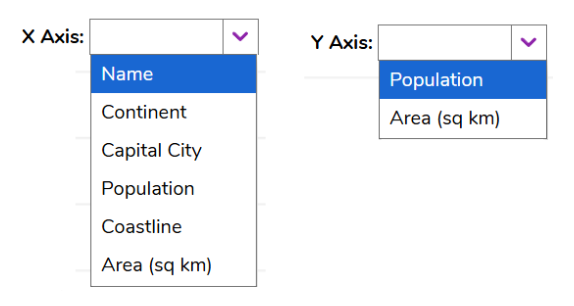
Ask the class - What does this chart show us?
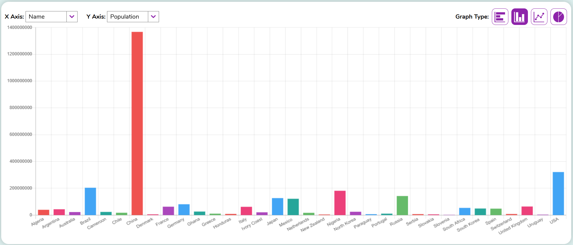
It shows us how many people live in each country. The larger the bar, the more people live there. The number scale on the Y axis goes from 0 at the bottom, to 1,400,000,000 (1.4 billion)
Too much data
Charts are only useful if they are easy to read and interpret. Having too much data on a chart can make it meaningless or inaccurate. This chart of animal top speeds has too many animals, so the names at the bottom don't fit and do not line up with the bars, which makes it impossible to read.
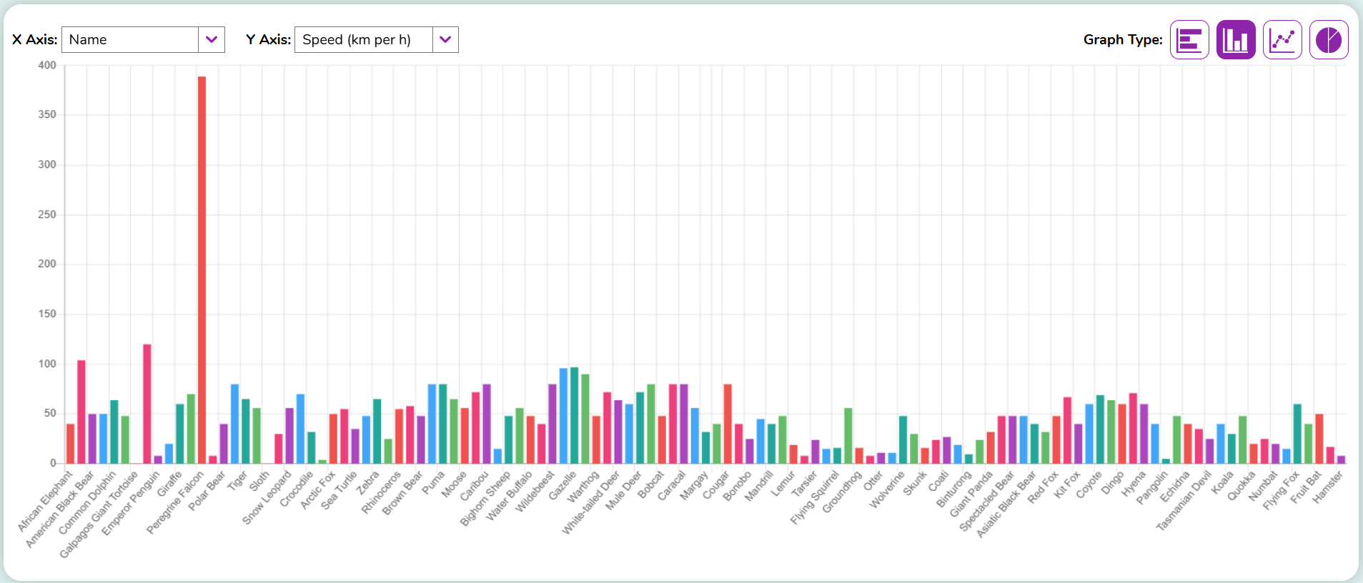
To solve the problem, we’ve applied a filter to the data. Ask the class - What does this filter (and the chart) now show?
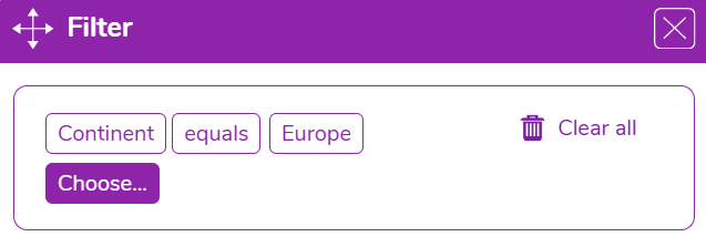
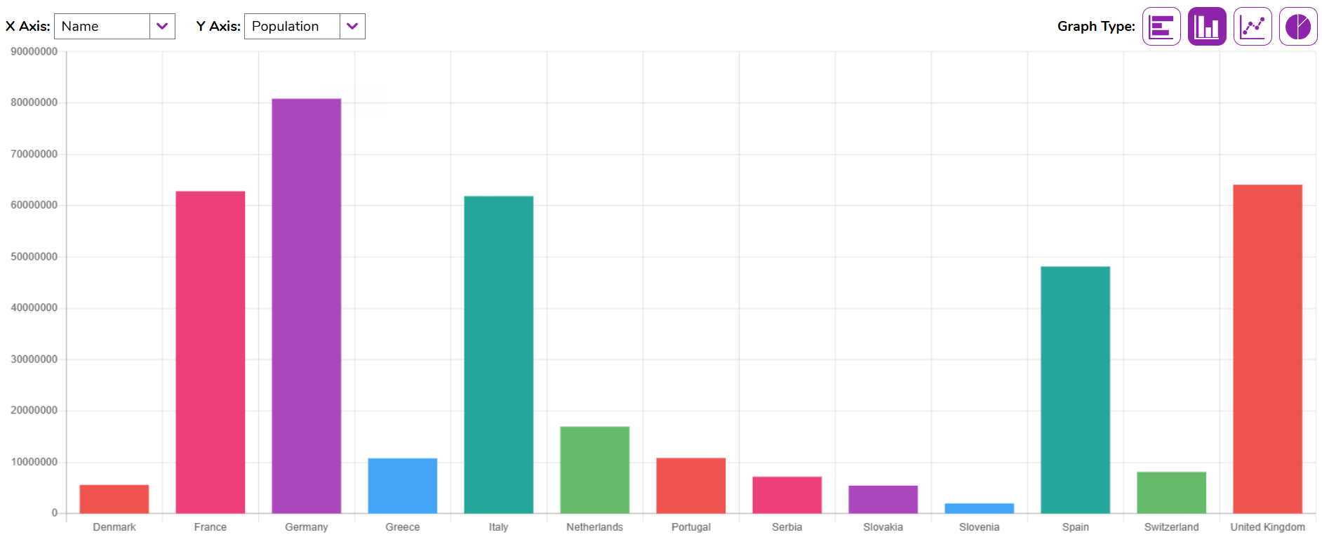
Now the chart only shows countries in the continent of Europe. It would be important to include this in the title or an explanation of the graph, otherwise somebody might assume that Germany has the biggest population over all.
Create a chart
Ask the class to have a go at creating bar charts to show the following. Explain that they may need to use filters before making your chart:
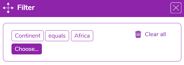
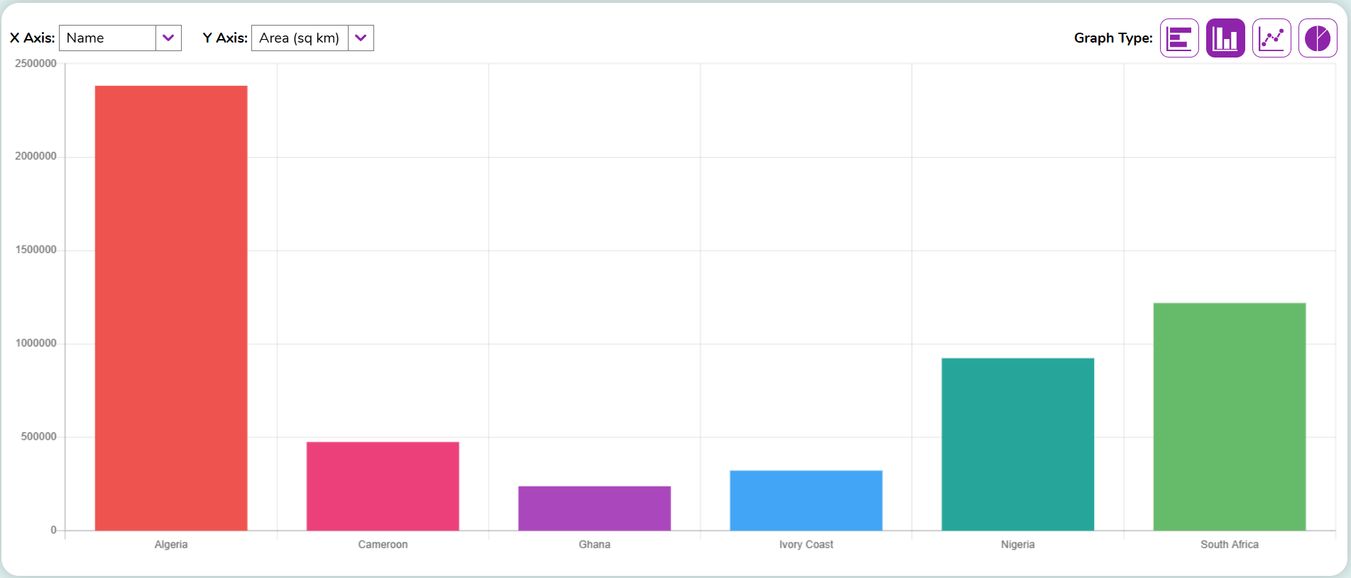
- Area of countries in Africa.
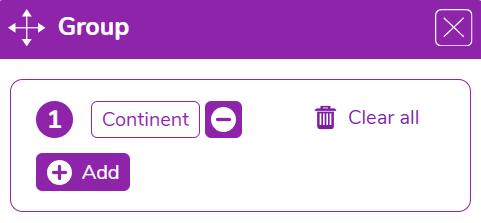
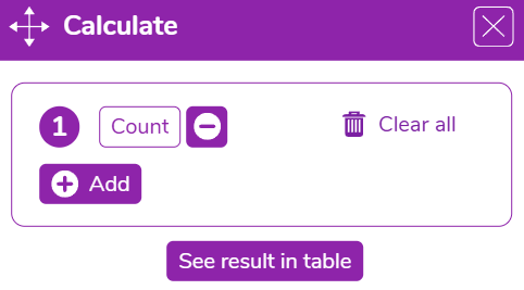
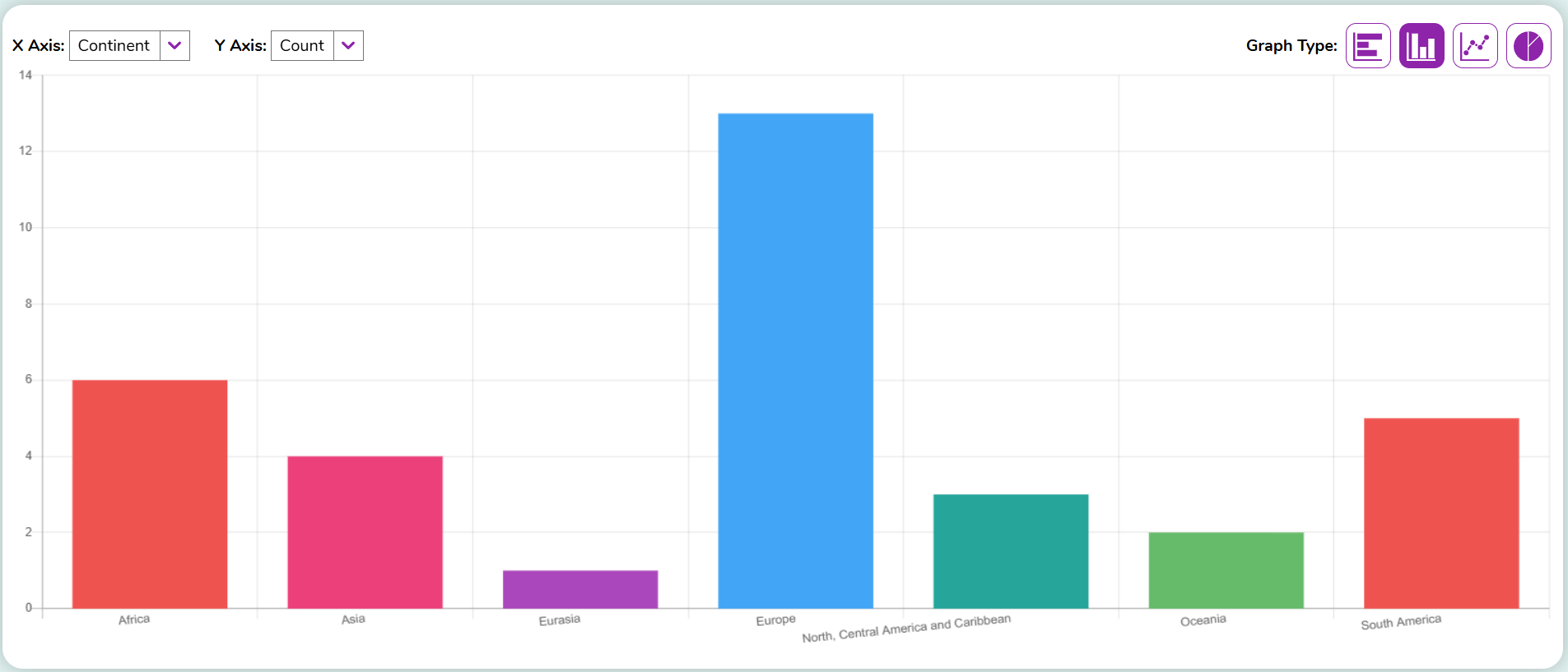
- Number of countries in each continent.
Hint - First group by continent and then use calculate to count
Area of countries in Africa:
Number of countries in each continent.
To finish
Ask the class to discuss and then explain what these three methods mean for searching a database:
- Sort
- Group
- Filter
Why can charts be a useful way to present data?