
Creating Graphs from Data
Finding and Presenting Information - Lessons 3 & 4
Objectives
- Use simple graphing software to produce pictograms and other basic tables or graphs.
- Use graphing software to enter data and change a graph type, e.g. pictogram to bar chart.
- Interpret and draw conclusions from graphs, discuss information contained and answer simple questions.
Lesson Resources
- Lesson slides
- Mini-beast task sheets from lesson 1 (more able/ less able)
Lesson 1 - Looking For Facts
Lesson 2 - Searching Sites
Lesson 3 & 4 - Creating Graphs From Data
Lesson 5 - Branching Databases
Lesson 6 - Searching Databases
Introduction
Please note - The following tasks are expected to span two lessons.
Recap the last two lessons on searching websites and finding information. Discuss and remind them of the techniques they used for browsing and searching websites. Today we are going to look at how to turn information (or data) into graphs using the computer.
Making graphs
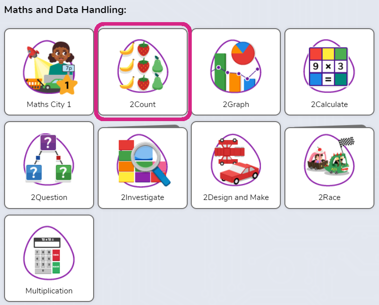
Log into Purple Mash, go into Tools and open 2Count from the Maths and Data Handling section.

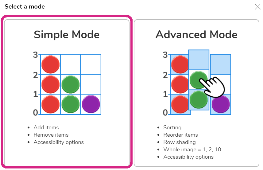
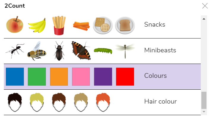
Choose Simple Mode and then scroll down and choose Colours from the menu.
Look at the screen together when it opens up, what type of graph do you think this will create?
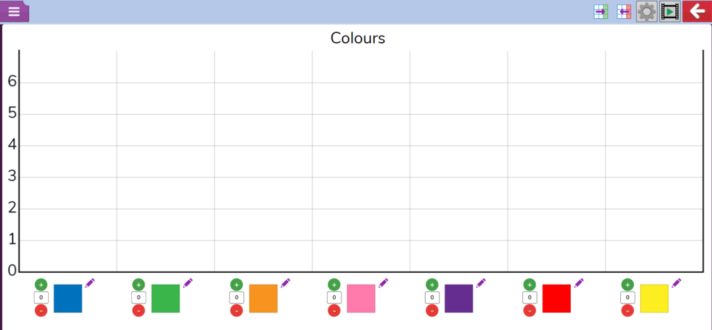
Take a look at the colours at the bottom of the screen, which is your favourite from those colours? Take a quick hand survey for each colour and add the number of votes to each column as you go by clicking on the coloured blocks.
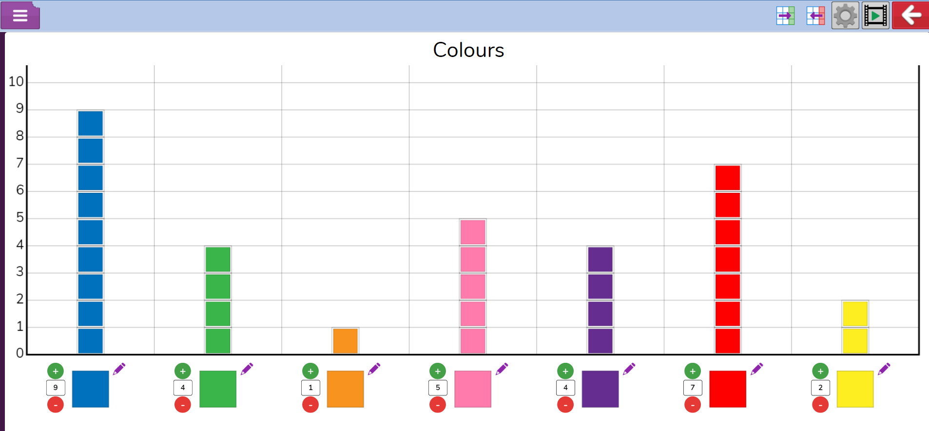
Once completed, ask some questions that will require them to interpret the graph. What is the most popular colour? Which is the least popular colour? What’s the difference between the number of people that voted orange and purple? etc
In the first lesson we completed some research on mini-beasts. Today we are going to turn some of that data into graphs.
Gathering data
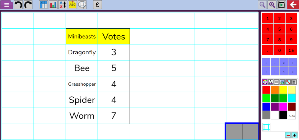
First we need to do a quick survey to find out which of the mini-beasts we researched are our favourites.
Agree on 6 mini-beasts and conduct a quick and survey. You can record the results on paper, a whiteboard or using something like 2Calculate to create a quick frequency table (Just type in the cells)
Build a pictogram
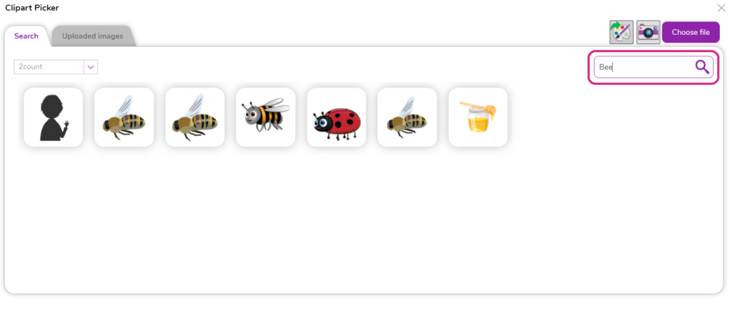
To show the results we will create a pictogram with 2Count. Start a new file, and again choose simple mode. This time select the choose own option from the box.
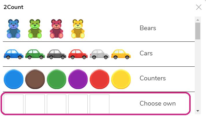
In each graph column, click the pencil icon to add your own picture. You can draw your own or use the clip art which is provided (or a combination if there's certain things you can't find in the clip art). Use the search box to find what you need.
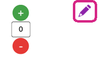
When they have completed their pictures, they should click on the + sign next to each mini-beast the correct number of times (or type in the numbers) to represent the number of votes each one received.
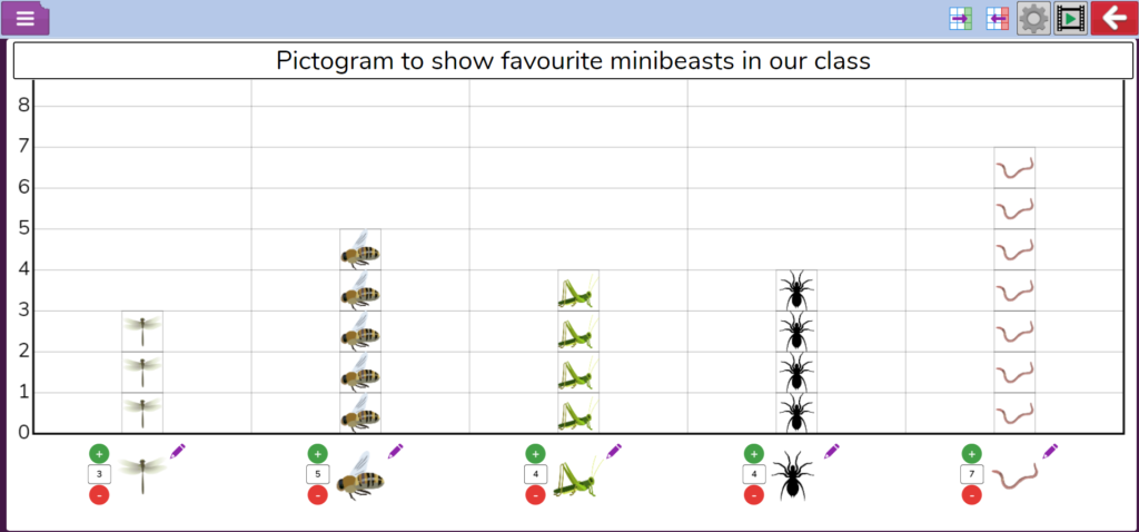
Which was the most popular mini-beast? Which was the least popular? Did any get the same number of votes?
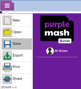
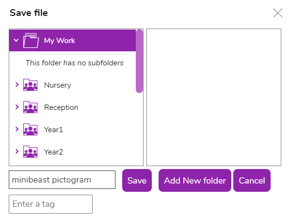
Ask everyone to save their work from the file menu.
Exit 2Count.
Build a barchart
What is the difference between a pictogram and a barchart? Open 2graph from the Maths and Data Handling section in Purple Mash > Tools.
When it opens, take a look at the screen with the class. How do you think we create a barchart with this? What do you think the table on the left is for?
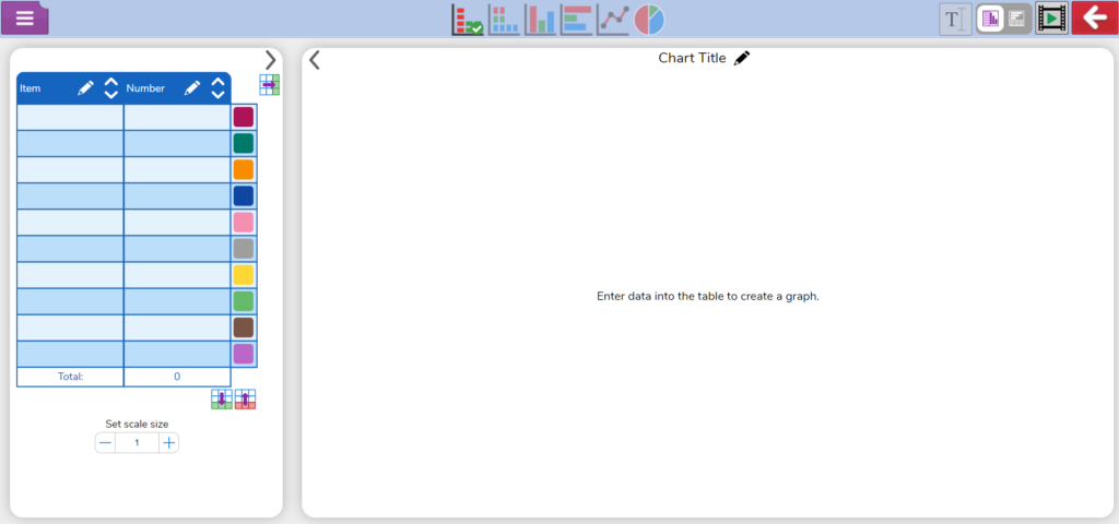

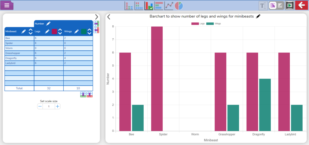
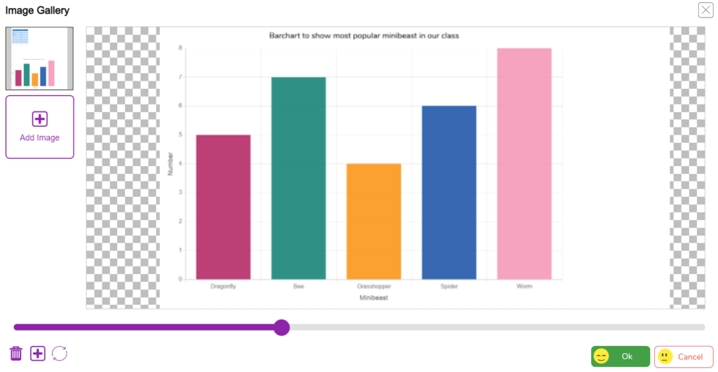
Show that this is where you add your data. Remind them that when they did their research in lesson one, they also found out how many legs each creature has. We are going to create a bar chart to represent that data.
Ask them to add the names of the mini-beasts to the first column of the table. As they begin to add numbers to the second column, 2graph will automatically create a barchart for them (ensure they have clicked on the barchart option at the top).
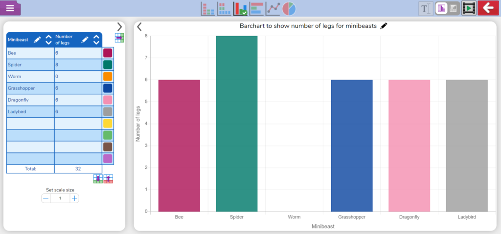
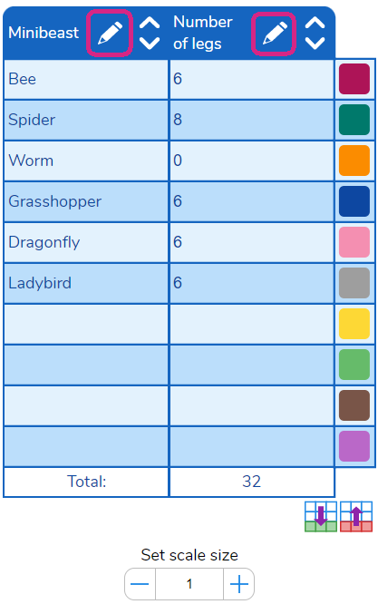
They should then complete the graph by adding a suitable title (click the pencil icon by the title) and labels for the axis (edit these in the table headers with the pencil icons).
They might want to experiment with some of the other kinds of graphs and there is opportunity to discuss why some don’t work with this kind of data, like a line graph.
Some children may be able to add a second data set, such as number of wings, to their table and graph. Click the add column button next to the table to do this.
![]()
Some small adjustments to labels and titles may be needed to make sure everything makes sense. Click the
Save their work at this point.
Interpreting your data
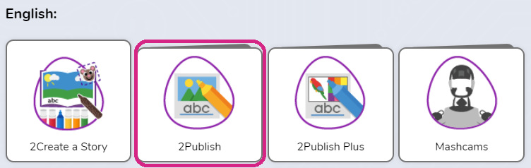
If you have the time, their final task is to demonstrate that they can combine different files and interpret the data in their graph. Open 2Publish from the tools section in Purple Mash.
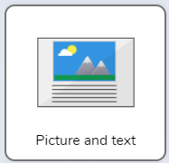
Choose the template called Picture and text.
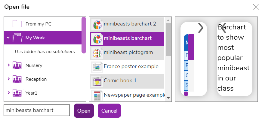
When the page loads, click on the icon in the picture box to choose an image.
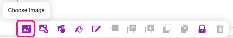
Then click Add image and Choose file. This will take you to the saved work area in Purple Mash, where you should be able to find your saved barchart work. Open the file.


Click on the imported image on the left. You'll then see your work inside this picture box. Use the zoom slider at the bottom and drag the image around to position the work so you only see the graph and its centred on the screen. Don't worry about the empty side parts. Click OK when it's in position.
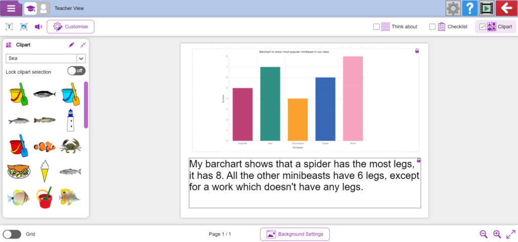
Finally, ask the children to click in the text box and add a few sentences that describe the data in the graph.
Save and/or print their work.
Plenary
Evaluate the students' learning with the following questions: What types of graph have you created so far? What are the differences between them? What could you tell by looking at your graph?