
Building and searching a database
Databases - Lesson 3
Objectives
- To insert records into a database.
- To insert information into fields of a database.
- To look through a database to find information. Think, discuss and try different searching methods.
Lesson Resources
- Lesson Slides
- Weather database question worksheet
- Your version of the ‘Weather around the world’ spreadsheet from lesson 2.
- 2Investigate (from Purple Mash or the 2Simple collection)
Lesson 1 - What is a database?
Lesson 2 - Weather data
Lesson 3 - Building and searching a database
Lesson 4 - Turning data into graphs
Lesson 5 - Collecting data with online forms
Lesson 6 - Analysing results and presenting findings
Notes
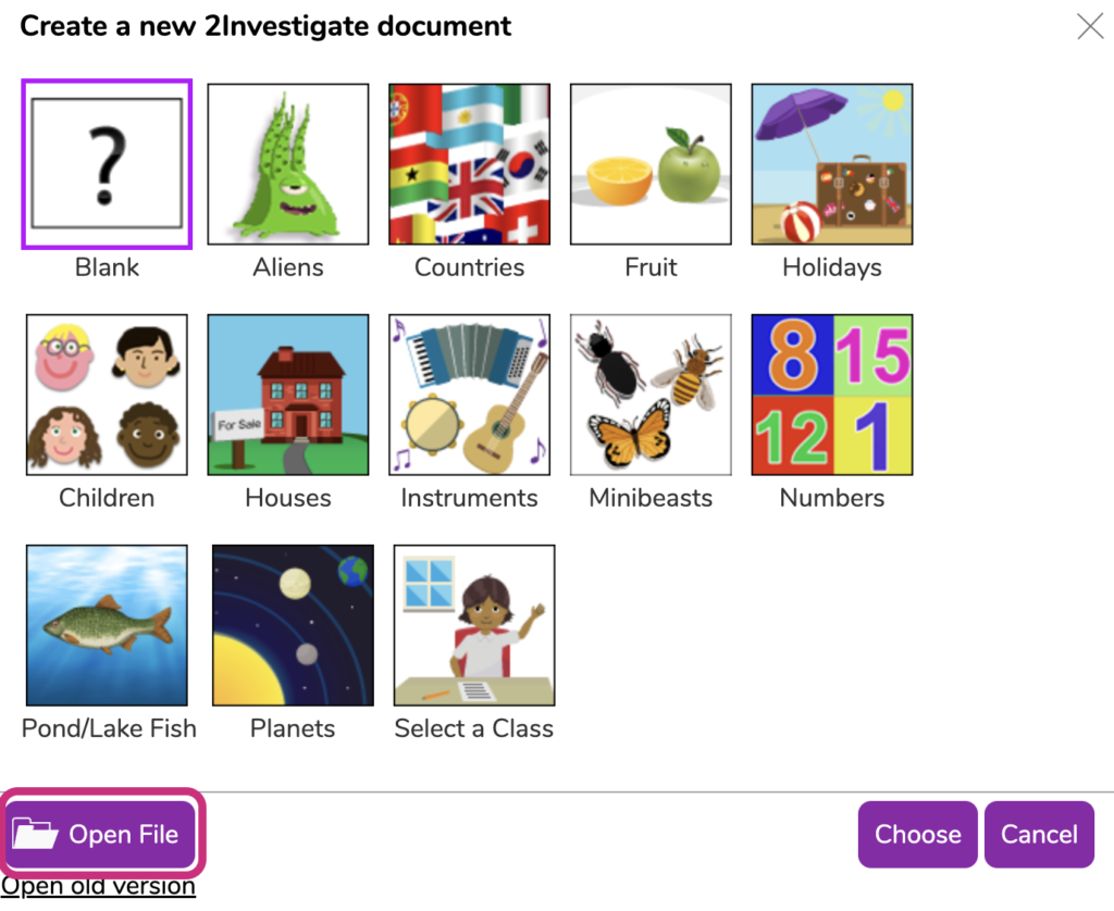
Before the lesson, log into Purple Mash and go to Tools > Maths and Data Handling > 2Investigate. Open a new blank database.

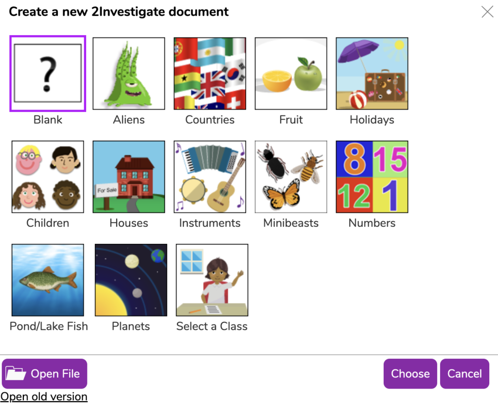
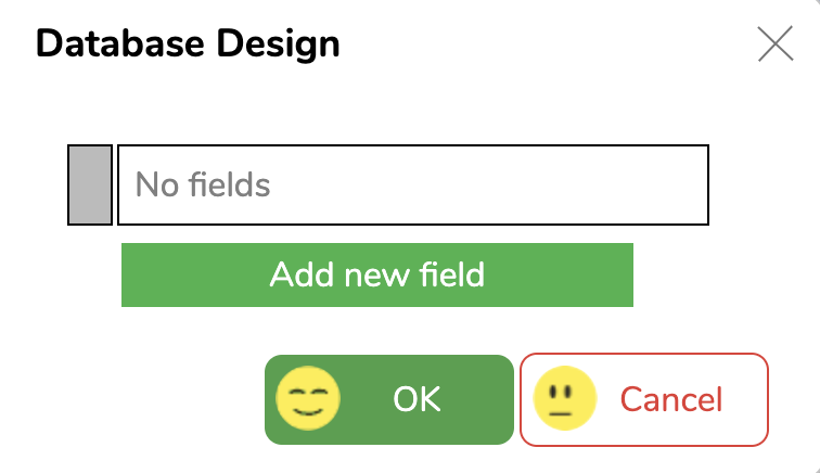
Leave the database design with no fields for now, we'll come back to this later in the lesson. Click OK
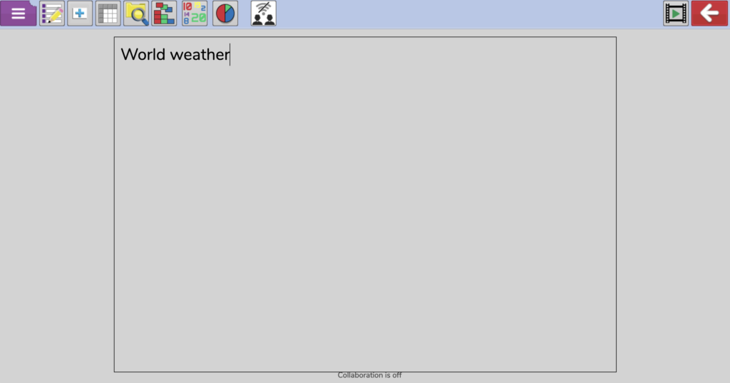
Then complete the setup by adding a title to the page:
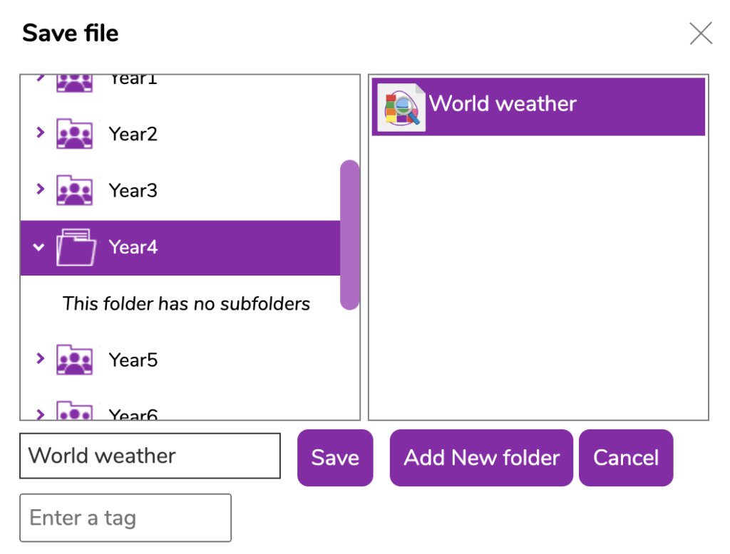
Save the empty database into a shared year group or class folder in Purple Mash that the children in your class will be able to access.
Introduction
Ask the students - What did we do in our last lesson? What data did you have to collect? How can we get back to the spreadsheet database we created last week?
Introduce the children to 2Investigate from Purple Mash. Tell them that we are going to use last week’s data to create another, different kind of collaborative database.
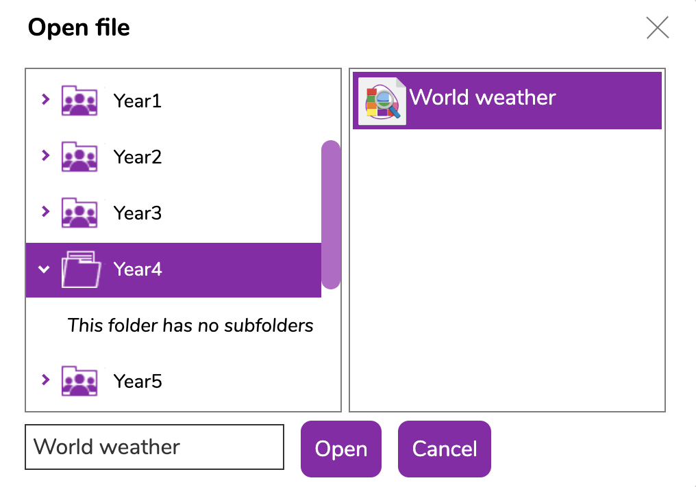
Log into Purple Mash and show them how to open the program and open the database you set up before the lesson.
Choose Open File and browse for the saved file.
Database design
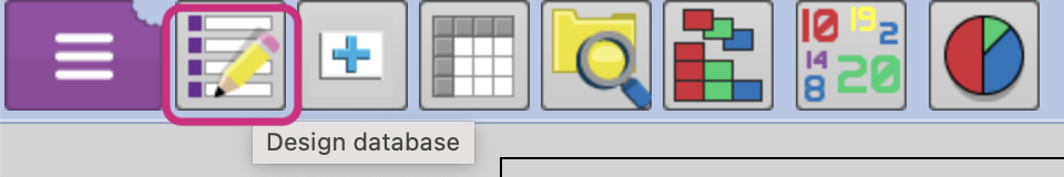
Once the empty database is open go to Design database at the top of the screen.
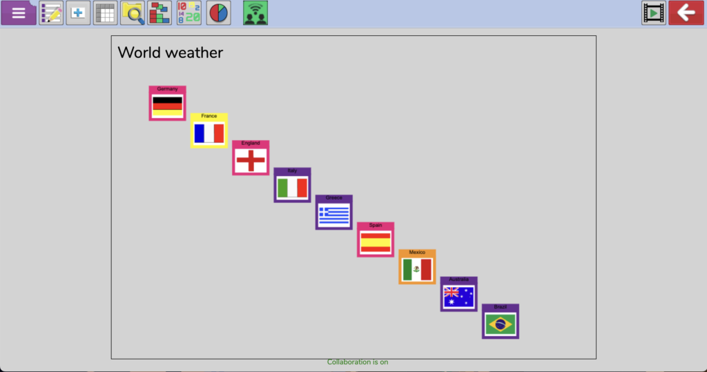
These ‘cards’ mirror a more old-fashioned database style when things were done on paper. Each card is a record (what was one row on the spreadsheet last week). Old fashioned address books might have had a card for each person which would then have a number of pieces of information (fields) such as name, address, phone number, email address etc.
We’re going to create our database using these digital cards about our countries. Together we will create the design for the blank cards with all the required fields and titles, then the students will complete the cards with the data they collected last time.
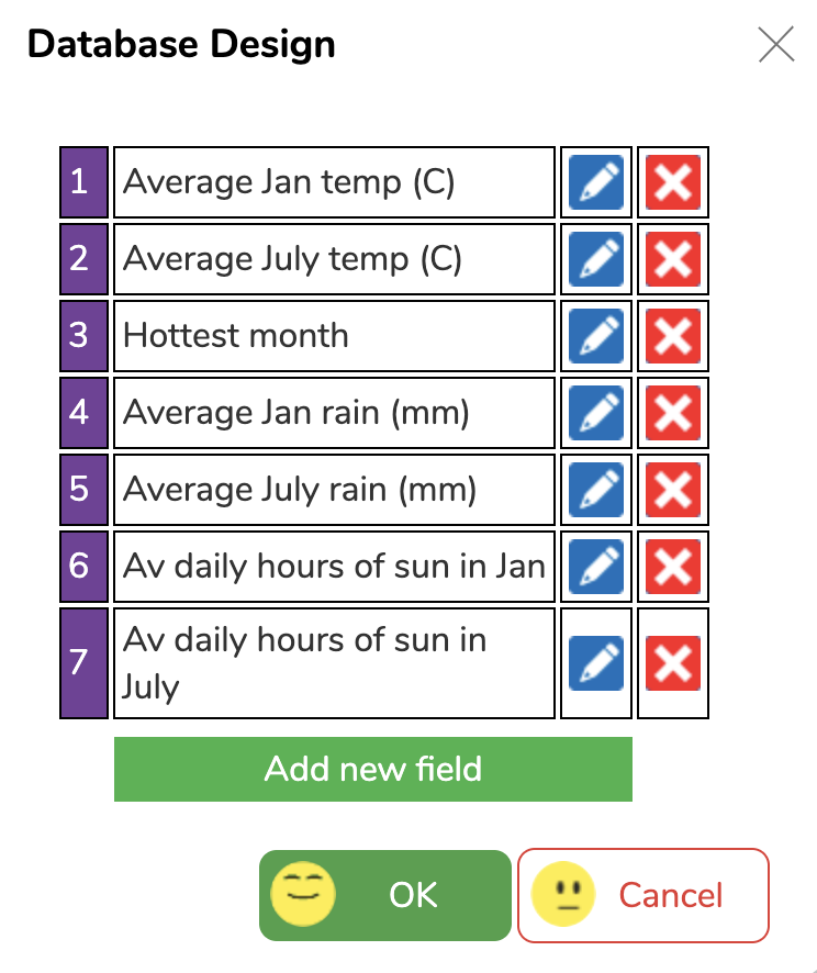
How many fields will we need? We need 7, one for each of the categories we researched last week:
- Average temperature in January (℃)
- Average temperature in July (℃)
- Hottest month of the year
- Average rainfall in January (mm)
- Average rainfall in July (mm)
- Average Daily hours of sunshine in January
- Average Daily hours of sunshine in July
Add the first new field as average temperature for January (you may need to abbreviate it to fit). Discuss the ‘Type of field’ choice, what’s best for this field? Will we need to enter letters or numbers? Should we use a list to choose from? The best settings for this field are Numbers and no list as there are too many options (30) to use this feature or to make it efficient. Click OK when done.
Continue adding the other fields together as a group, discussing what type of information is needed for each. Apart from ‘hottest month’ the rest should only require numerical data.
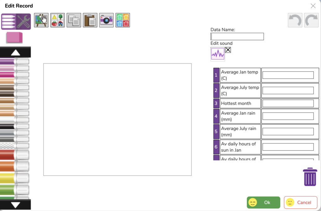
When all the fields have been completed it should look a bit like this. From here you can see all the titles and make any edits if needed. Press OK to finish.
When you are happy with the setup of the cards, turn on the collaboration feature so that the students will be able to add cards to this shared database. Click the collaborate icon and you will be prompted again to save the database to a shared folder. Do that and the collaborate button should go green.


Main task
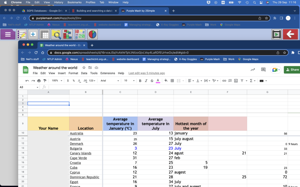
The students should then transfer their data from last week into these cards. They need to sign back into their Google or Office 365 account and open the shared spreadsheet and then open Purple Mash and 2Investigate in another tab in their browser. Ask them to open the World Weather database from the shared folder.
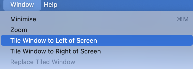
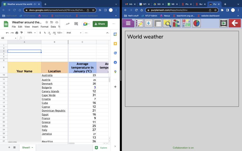
Demonstrate how they can easily switch between tabs to see and work on the two different apps. In Chrome, you can also split your screen to show two windows.
First, drag one of your tabs out into a new window, then go to the Window menu > Tile Window to Left of Screen.
Adding records
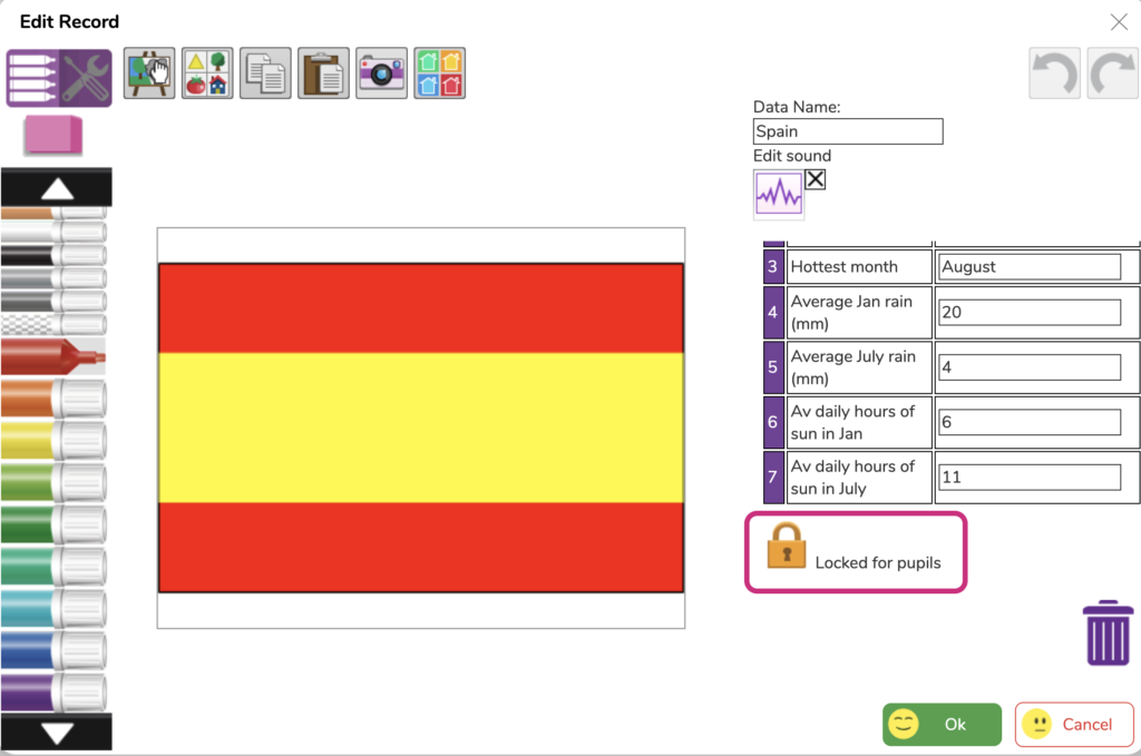
They should then click on add record (they do not need to design the cards again!)
From here they can design their record and add their data.
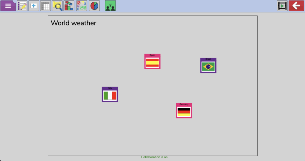
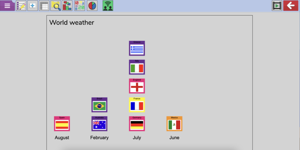
Here's an example.
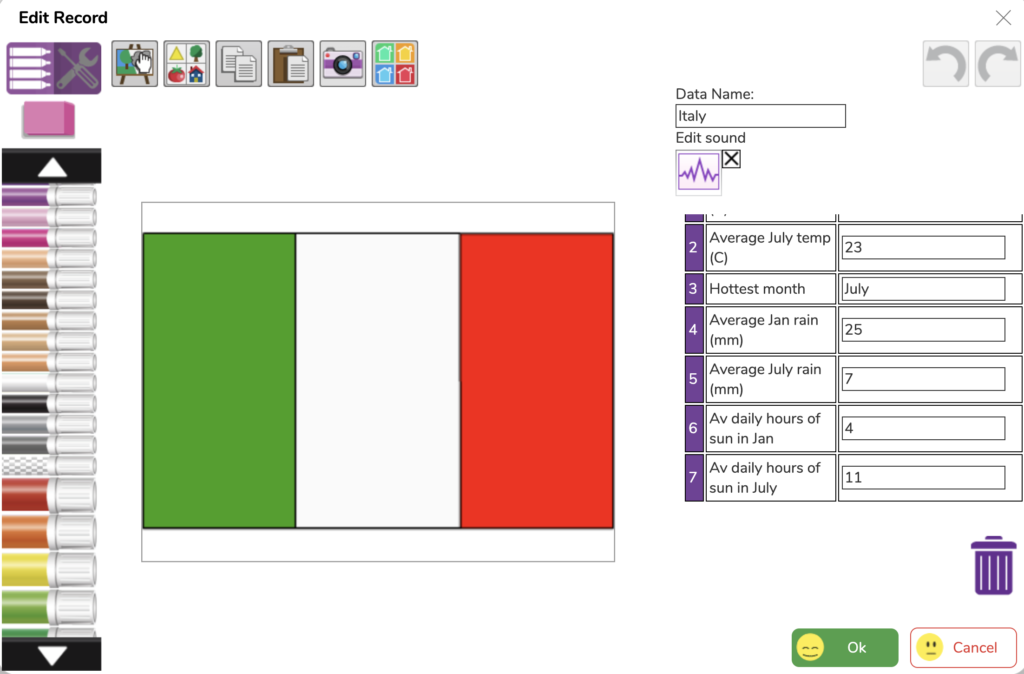
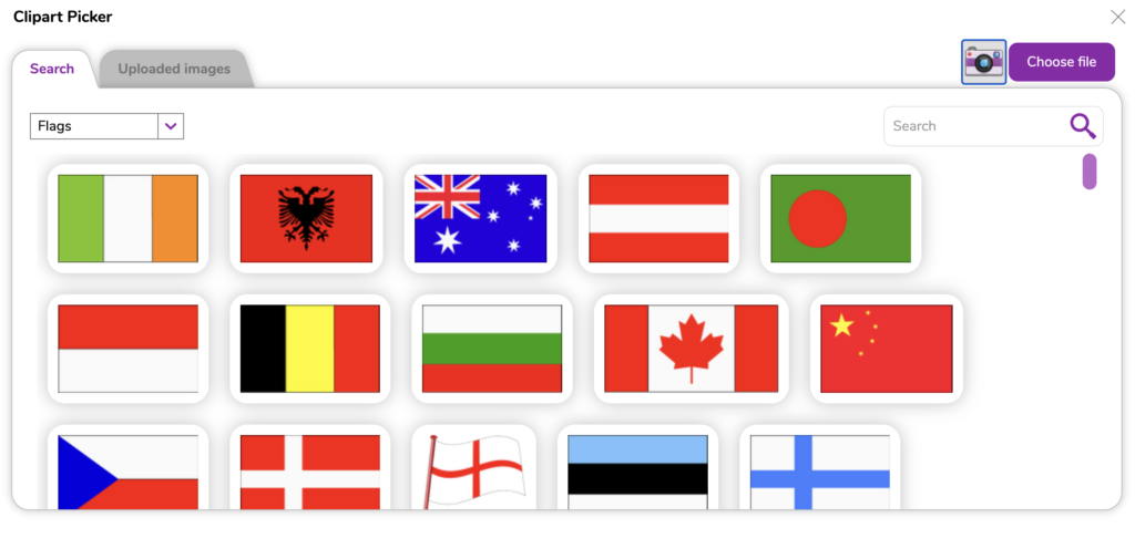
When adding a picture, flags are a great option. If you go to the Purple Mash clipart, there is a flag category with a great selection to choose from. They can also use the drawing tools if needed.
When they have finished inputting their data and image onto their card they can press OK. Records that other people have completed should also start to show up on their screens.
As they appear, on your own screen open each record and lock it from further editing by the students.
When all the records are completed, show the students how they can click on any record to view its content, but also see a really useful summary of all the cards in a table, which is more like the spreadsheet view we had in the last lesson.
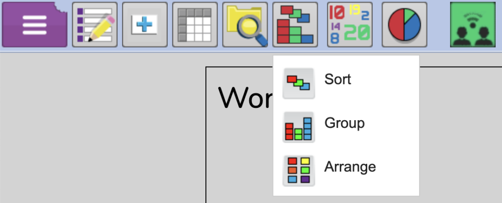
A great way to get quick answers to questions like ‘which country has the most rain in January?’ or ‘in how many countries is July the hottest month?’ is to use the Sort, Group, and Statistics features.
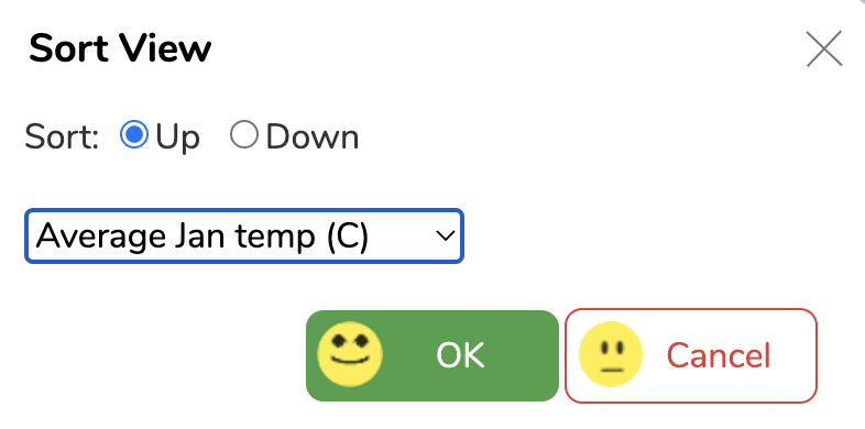
Sorting
Choose Sort and then pick the category you want to sort and whether you want the data going up or down, then sit back and watch the cards sort themselves.
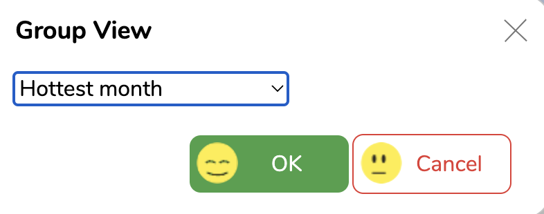
Grouping
Grouping works in the same way. You need to consider which category is used as not all data types will give meaningful results.
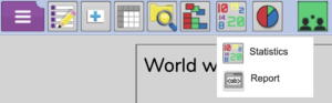
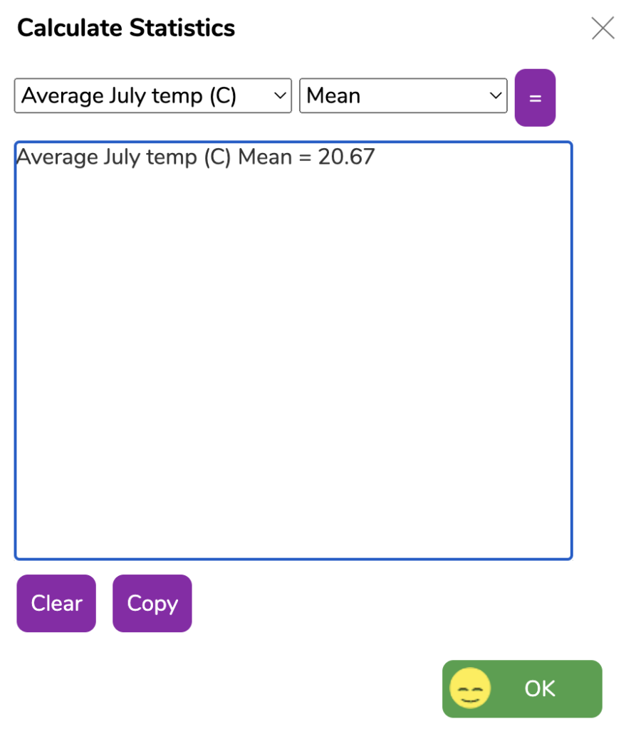
Statistics
Statistics can give you even more data analysis. You can do simple things like a count or percentage count for a category, like this example:
![]()
You can also find minimum, maximum or mean average values for a category, the range from top to bottom of all answers or the total of all entries in a category.
Give the students the chance to experiment with all three of these options, before asking them to tackle the questions on the worksheet. They can do this on their own or with a partner (at your discretion). For each one, they should consider which is the best method for finding the answer (group, sort, or statistics).
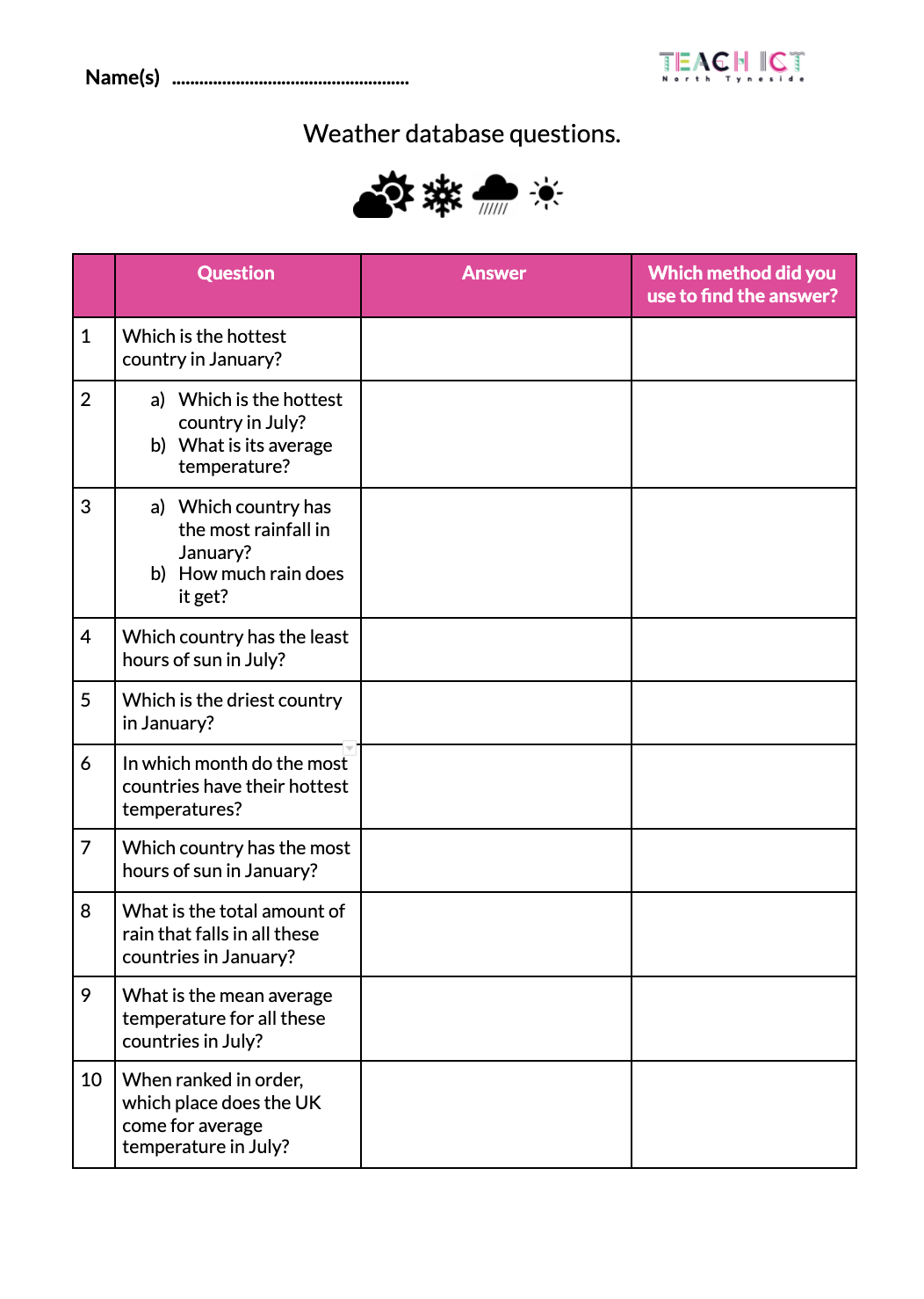
Answers are not provided as they may vary depending on what data is entered from the weather website (the cities students select) and the countries that have been chosen, especially if your class adds extra countries.
Plenary
Go through answers to the questions above and ask students to explain how they found the answers using the sort, group, or statistics tools.